Covid 19 - Cases and Exams - Santigo de Chile
Currently there is a lot of conversation about when and how deconfinement can begin in Santiago de Chile. As already mentioned in a previous post on mobility, five communes in the the conurbation of Santiago and two more in the Metropolitan Region began phase two of the deconfinement plan Paso a Paso on the 28th July 2020.
This plan has five deconfinement steps from full quarantine to advanced opening. There are several criteria for when a commune can move forward or backward. The criteria are:
- Regional Intensive Care Unit(ICU) occupation
- National ICU occupation
- Communal R rate
- Projected rate of regional cases
- Regional positivity
- Percentage of isolated cases in 48 hours
- Percentage of new cases that come from follow-up contacts
Taking this information into account, it is clear that the data for the number of cases is very important. If the number of new known cases is analyzed each day in the Metropolitan Region it is apparent that cases have been decreasing. However, to check if this improvement is real, it is necessary to compare the number of cases against the number of PCR tests. This is the objective of this post.
2) Packages
The following packages are used in this post.
library(ggplot2)
library(dplyr)
library(stringr)
library(readr)
library(lubridate)
3) Data
Data from the Ministry of Health in Chile is used, which can be downloaded from its github. Specifically, the following data is used:
- product 3 - accumulated cases of Covid 19 at the regional level
- product 7 - PCR tests at the regional level
4) Behavior of Known Cases in the Metropolitan Region
In order to map the number of cases in the Metropolitan Region some feature engineering is first done to prepare the data.
The data is filtered to only include data from the Metropolitan Region. Then the number of new cases every day is calculated. The figure for new cases on June 17 is changed as on that day 31,412 cases that were previously unknown, were added to the total of known cases. Therefore, for June 17 there is a figure of 32,230 new cases in the Metropolitan Region. This figure is changed to 4,022 cases so that the data only specifically reflects new known cases each day.
Metropolitana_Casos_Dia <- CasosTotalesCumulativo_T %>% select(Region, Metropolitana) %>%
  mutate(NuevosCasosDia = Metropolitana - lag(Metropolitana))

Metropolitana_Casos_Dia[107,03] <- 4022

ggplot(data = Metropolitana_Casos_Dia) + geom_point(aes(x = Region, y = NuevosCasosDia)) + ylim(0,7000) + ggtitle("New Daily Cases") + ylab("New Daily Cases") + xlab("Date")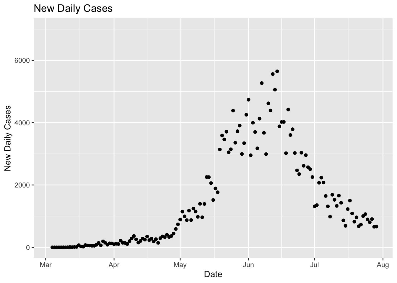
The graph above shows that new cases in the Metropolitan Region increased between May and the first half of June. The high point was June 14 with 5,647 new cases registered. Since that time the cases have been going down with 666 cases registered today on July 29. This is good news - but what happens when new cases are compared to the number of PCR tests?
5) Number of PCR Tests
Data for the number of daily PCR tests is available from April 9th. Therefore, new observations for March 3rd to April 8th are created, since March 3rd is when the data for new cases starts.
Metropolitana_PCR <- PCR_T %>% select(Region, Metropolitana)

Metropolitana_PCR <- Metropolitana_PCR[-c(1:2),]

Metropolitana_PCR <- rbind(data_frame(Region = seq(as.Date("2020-03-03"), as.Date("2020-04-08"), "day"),
           Metropolitana = rep(0, 37)), Metropolitana_PCR)
The two databases are combined and the new cases and PCR tests are graphed.
Metropolitana_Casos_PCR <- left_join(Metropolitana_Casos_Dia, Metropolitana_PCR, by = "Region")

colnames(Metropolitana_Casos_PCR) <- c("Fecha", "CasosAcumulados", "NuevosCasosDía", "ExamenesPCR")

ggplot(data = Metropolitana_Casos_PCR) + geom_point(aes(x = Fecha, y = NuevosCasosDía, color = ExamenesPCR)) +
  scale_color_continuous(low = "blue", high = "green") + ggtitle("Daily Cases and PCR Tests") +
  ylab("Daily Cases") + xlab("Date")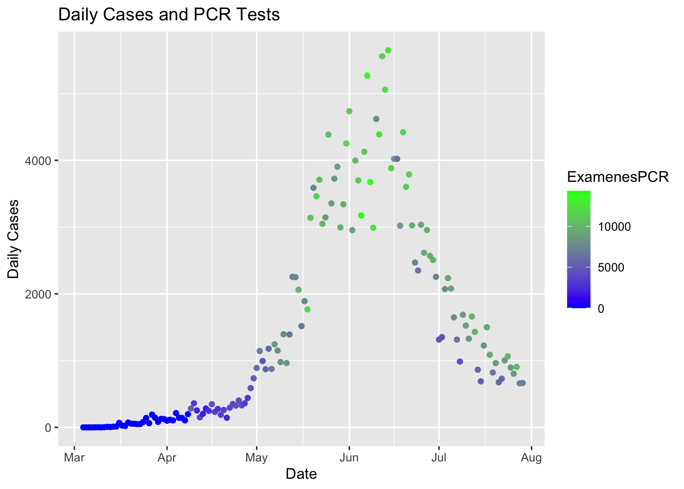
The graph above shows how between the middle of June and the end of July the number of new cases has decreased but at the same time the number of examinations has also decreased. The following figures show the average number of daily PCR tests for 15 day periods since the beginning of May.
Metropolitana_Casos_PCR$Mes <- month(Metropolitana_Casos_PCR$Fecha)
Metropolitana_Casos_PCR$DiaMes <- day(Metropolitana_Casos_PCR$Fecha)
1st - 15th May
Average PCR tests each day = 7.171 Average Covid 19 cases each day = 1.310
Metropolitana_Casos_PCR %>% filter(Mes == 5 & DiaMes %in% c(1:15)) %>% summary() #7171 #1310 ## Fecha CasosAcumulados NuevosCasosDía ExamenesPCR Mes
## Min. :2020-05-01 Min. :10516 Min. : 872 Min. :4570 Min. :5
## 1st Qu.:2020-05-04 1st Qu.:14118 1st Qu.: 971 1st Qu.:6284 1st Qu.:5
## Median :2020-05-08 Median :17979 Median :1151 Median :7173 Median :5
## Mean :2020-05-08 Mean :18550 Mean :1310 Mean :7171 Mean :5
## 3rd Qu.:2020-05-11 3rd Qu.:22013 3rd Qu.:1394 3rd Qu.:8092 3rd Qu.:5
## Max. :2020-05-15 Max. :29276 Max. :2256 Max. :9948 Max. :5
## DiaMes
## Min. : 1.0
## 1st Qu.: 4.5
## Median : 8.0
## Mean : 8.0
## 3rd Qu.:11.5
## Max. :15.016th - 31st May
Average PCR tests each day = 9.561 Average Covid 19 cases each day = 3.202
Metropolitana_Casos_PCR %>% filter(Mes == 5 & DiaMes %in% c(16:31)) %>% summary() #9561 #3202## Fecha CasosAcumulados NuevosCasosDía ExamenesPCR
## Min. :2020-05-16 Min. :30794 Min. :1518 Min. : 6555
## 1st Qu.:2020-05-19 1st Qu.:40282 1st Qu.:3036 1st Qu.: 8680
## Median :2020-05-23 Median :52972 Median :3348 Median : 9853
## Mean :2020-05-23 Mean :53902 Mean :3202 Mean : 9561
## 3rd Qu.:2020-05-27 3rd Qu.:66987 3rd Qu.:3713 3rd Qu.:10658
## Max. :2020-05-31 Max. :80504 Max. :4386 Max. :11992
## Mes DiaMes
## Min. :5 Min. :16.00
## 1st Qu.:5 1st Qu.:19.75
## Median :5 Median :23.50
## Mean :5 Mean :23.50
## 3rd Qu.:5 3rd Qu.:27.25
## Max. :5 Max. :31.001st - 15th June
Average PCR tests each day = 11.555 Average Covid 19 cases each day = 4.252
Metropolitana_Casos_PCR %>% filter(Mes == 6 & DiaMes %in% c(1:15)) %>% summary() #11555 #4252## Fecha CasosAcumulados NuevosCasosDía ExamenesPCR
## Min. :2020-06-01 Min. : 85239 Min. :2955 Min. : 7792
## 1st Qu.:2020-06-04 1st Qu.: 97478 1st Qu.:3686 1st Qu.:10992
## Median :2020-06-08 Median :112136 Median :4128 Median :11550
## Mean :2020-06-08 Mean :112833 Mean :4252 Mean :11555
## 3rd Qu.:2020-06-11 3rd Qu.:126914 3rd Qu.:4896 3rd Qu.:12278
## Max. :2020-06-15 Max. :144280 Max. :5647 Max. :14331
## Mes DiaMes
## Min. :6 Min. : 1.0
## 1st Qu.:6 1st Qu.: 4.5
## Median :6 Median : 8.0
## Mean :6 Mean : 8.0
## 3rd Qu.:6 3rd Qu.:11.5
## Max. :6 Max. :15.016th - 30th June
Average PCR tests each day = 9.144 Average Covid 19 cases each day = 3.111
Metropolitana_Casos_PCR %>% filter(Mes == 6 & DiaMes %in% c(16:30)) %>% summary() #9144 #3111## Fecha CasosAcumulados NuevosCasosDía ExamenesPCR
## Min. :2020-06-16 Min. :148302 Min. :2255 Min. : 6143
## 1st Qu.:2020-06-19 1st Qu.:189776 1st Qu.:2538 1st Qu.: 7942
## Median :2020-06-23 Median :200861 Median :3021 Median : 9508
## Mean :2020-06-23 Mean :197809 Mean :3111 Mean : 9144
## 3rd Qu.:2020-06-26 3rd Qu.:210340 3rd Qu.:3696 3rd Qu.: 9918
## Max. :2020-06-30 Max. :219151 Max. :4421 Max. :11662
## Mes DiaMes
## Min. :6 Min. :16.0
## 1st Qu.:6 1st Qu.:19.5
## Median :6 Median :23.0
## Mean :6 Mean :23.0
## 3rd Qu.:6 3rd Qu.:26.5
## Max. :6 Max. :30.01st - 15th July
Average PCR tests each day = 7.321 Average Covid 19 cases each day = 1.480
Metropolitana_Casos_PCR %>% filter(Mes == 7 & DiaMes %in% c(1:15)) %>% summary() #7321 #1480## Fecha CasosAcumulados NuevosCasosDía ExamenesPCR
## Min. :2020-07-01 Min. :220467 Min. : 690 Min. : 4439
## 1st Qu.:2020-07-04 1st Qu.:227168 1st Qu.:1316 1st Qu.: 5424
## Median :2020-07-08 Median :232158 Median :1431 Median : 7928
## Mean :2020-07-08 Mean :231984 Mean :1480 Mean : 7321
## 3rd Qu.:2020-07-11 3rd Qu.:237530 3rd Qu.:1674 3rd Qu.: 8963
## Max. :2020-07-15 Max. :241345 Max. :2236 Max. :10072
## Mes DiaMes
## Min. :7 Min. : 1.0
## 1st Qu.:7 1st Qu.: 4.5
## Median :7 Median : 8.0
## Mean :7 Mean : 8.0
## 3rd Qu.:7 3rd Qu.:11.5
## Max. :7 Max. :15.016th - 29th July
Average PCR tests each day = 8.089 Average Covid 19 cases each day = 929
Metropolitana_Casos_PCR %>% filter(Mes == 7 & DiaMes %in% c(16:29)) %>% summary() #8089 #929## Fecha CasosAcumulados NuevosCasosDía ExamenesPCR
## Min. :2020-07-16 Min. :242572 Min. : 660.0 Min. : 5588
## 1st Qu.:2020-07-19 1st Qu.:246224 1st Qu.: 748.8 1st Qu.: 7104
## Median :2020-07-22 Median :248854 Median : 901.5 Median : 8487
## Mean :2020-07-22 Mean :248928 Mean : 929.2 Mean : 8089
## 3rd Qu.:2020-07-25 3rd Qu.:251921 3rd Qu.:1049.5 3rd Qu.: 9078
## Max. :2020-07-29 Max. :254354 Max. :1501.0 Max. :10138
## Mes DiaMes
## Min. :7 Min. :16.00
## 1st Qu.:7 1st Qu.:19.25
## Median :7 Median :22.50
## Mean :7 Mean :22.50
## 3rd Qu.:7 3rd Qu.:25.75
## Max. :7 Max. :29.00These averages are stored in data frame a, with the averages being graphed below.
a <- tibble(Period = c("01 - 15 mayo", "16 - 31 mayo", "01 - 15 junio", "16 - 30 junio", "01 - 15 julio", "16 - 29 julio"),
           NewCasesDailyAvergae = c(1310, 3202, 4252, 3111, 1480, 929), PCRTestDailyAverage = c(7171, 9561, 11555, 9144, 7321, 8089))

a
## # A tibble: 6 x 3
## Period NewCasesDailyAvergae PCRTestDailyAverage
## <chr> <dbl> <dbl>
## 1 01 - 15 mayo 1310 7171
## 2 16 - 31 mayo 3202 9561
## 3 01 - 15 junio 4252 11555
## 4 16 - 30 junio 3111 9144
## 5 01 - 15 julio 1480 7321
## 6 16 - 29 julio 929 8089level_order_periodo <- c("01 - 15 mayo", "16 - 31 mayo", "01 - 15 junio", "16 - 30 junio", "01 - 15 julio", "16 - 29 julio")
ggplot(a) + geom_point(aes(x = factor(Period, levels = level_order_periodo) , y = NewCasesDailyAvergae), color = "red") +
geom_point(aes(x = factor(Period, levels = level_order_periodo), y = PCRTestDailyAverage), color = "Blue") +
ggtitle("Average daily cases and PCR tests for 15 day periods") + ylab("New Cases = Red / PCR Tests = Blue") +
xlab("Period")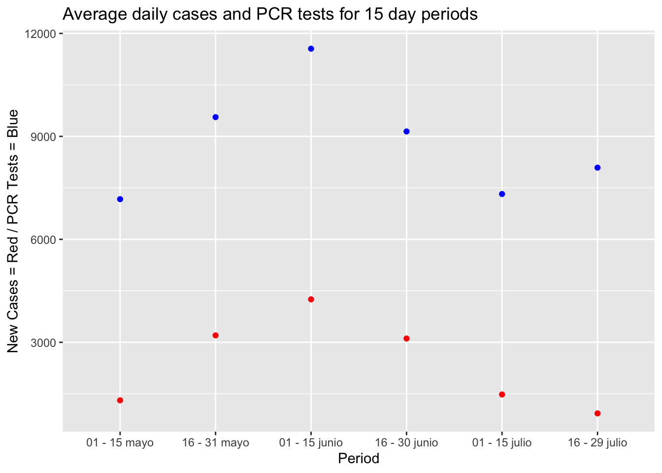
This graph shows several interesting points. First, it shows that the number of new cases and PCR tests in the Metropolitan Region have had similar behaviors throughout the pandemic. When the cases have increased, the examinations have also increased. Likewise, when the cases have dropped, the tests have also dropped. This has been the case for all periods except the most recient (July 16 - 29). The increase and reduction rates for the cases and exams are calculated below.
a %>% mutate(CasesRate = (NewCasesDailyAvergae / lag(NewCasesDailyAvergae))*100) %>% mutate(TestRate = (PCRTestDailyAverage / lag(PCRTestDailyAverage))*100) %>% mutate(positivity = (NewCasesDailyAvergae/PCRTestDailyAverage)*100) %>% select(Period, CasesRate, TestRate, positivity)## # A tibble: 6 x 4
## Period CasesRate TestRate positivity
## <chr> <dbl> <dbl> <dbl>
## 1 01 - 15 mayo NA NA 18.3
## 2 16 - 31 mayo 244. 133. 33.5
## 3 01 - 15 junio 133. 121. 36.8
## 4 16 - 30 junio 73.2 79.1 34.0
## 5 01 - 15 julio 47.6 80.1 20.2
## 6 16 - 29 julio 62.8 110. 11.5The increase and redcution rates for cases and examenes across the 15 day study periods show that:
Between May 1 and June 15 the rates of increase for the tests were 133% and 121%. The rate of increase for cases was positive with 244% and 133%. This behavior shows that with more tests the number of cases also increases. It also shows that in that period there was a very high rate of positivity. For example, for the period May 16 - 31, the positivity rate was 33.5%, that is to say that 33.5% of the tests for Covid 19 came back positive. The positivity for the period June 01 - 15 was also high with 36.8%.
At the beginning of July the government in Chile began to speak of a “slight improvement” with a reduction in cases. It is true that the known cases fell in the second half of June (27% reduction compared to the first half of the month) but despite that the number of examinations also fell with a very similar rate (20.9% reduction), as well as that, the rate of positivity remained very high at 34%.
In July cases have continued to decline, and this time there is some positive news. Firstly, in the first half of July, cases fell with a reduction of 52.4%%, with tests only dropping by 19.9%; which means that for that period the positivity rate was 20.2% and much closer to the 15%, 10%, 5%, and 1% required to move to different steps of deconfinement.
Furthermore, in the second half of July, cases have continued to decrease, with an increase in the number of examinations. This has resulted in a positivity rate of 11.5%.
To summarize with regards to these figures - they suggest that the situation in Santiago is improving. Yes in the second half of June when the cases decreased, it was only a reflection of the reduction in tests, but since then the cases have continued to decline, with the number of PCR tests decreasing much less or even increasing.
The graph below illustrates this point further with the normalization of cases being shown - that is, how many cases would there have been each day if 9,206 (third quartile of tests per day) had been done each day.
summary(Metropolitana_Casos_PCR$ExamenesPCR)## Min. 1st Qu. Median Mean 3rd Qu. Max.
## 0 1656 6547 5845 9206 14331Metropolitana_Casos_PCR <- Metropolitana_Casos_PCR %>% mutate(CasesNormalizados = (9206/ExamenesPCR)*NuevosCasosDía)
is.na(Metropolitana_Casos_PCR) <- sapply(Metropolitana_Casos_PCR, is.infinite)
Metropolitana_Casos_PCR[is.na(Metropolitana_Casos_PCR)] <- 0ggplot(data = Metropolitana_Casos_PCR) + geom_line(aes(x = Fecha, y = NuevosCasosDía), color = "red") +
geom_line(aes(x = Fecha, y = CasesNormalizados)) + ggtitle("Known new cases vs. Normalized cases") + ylab("Red = New Cases, Black = Normalized Cases") + xlab("Date")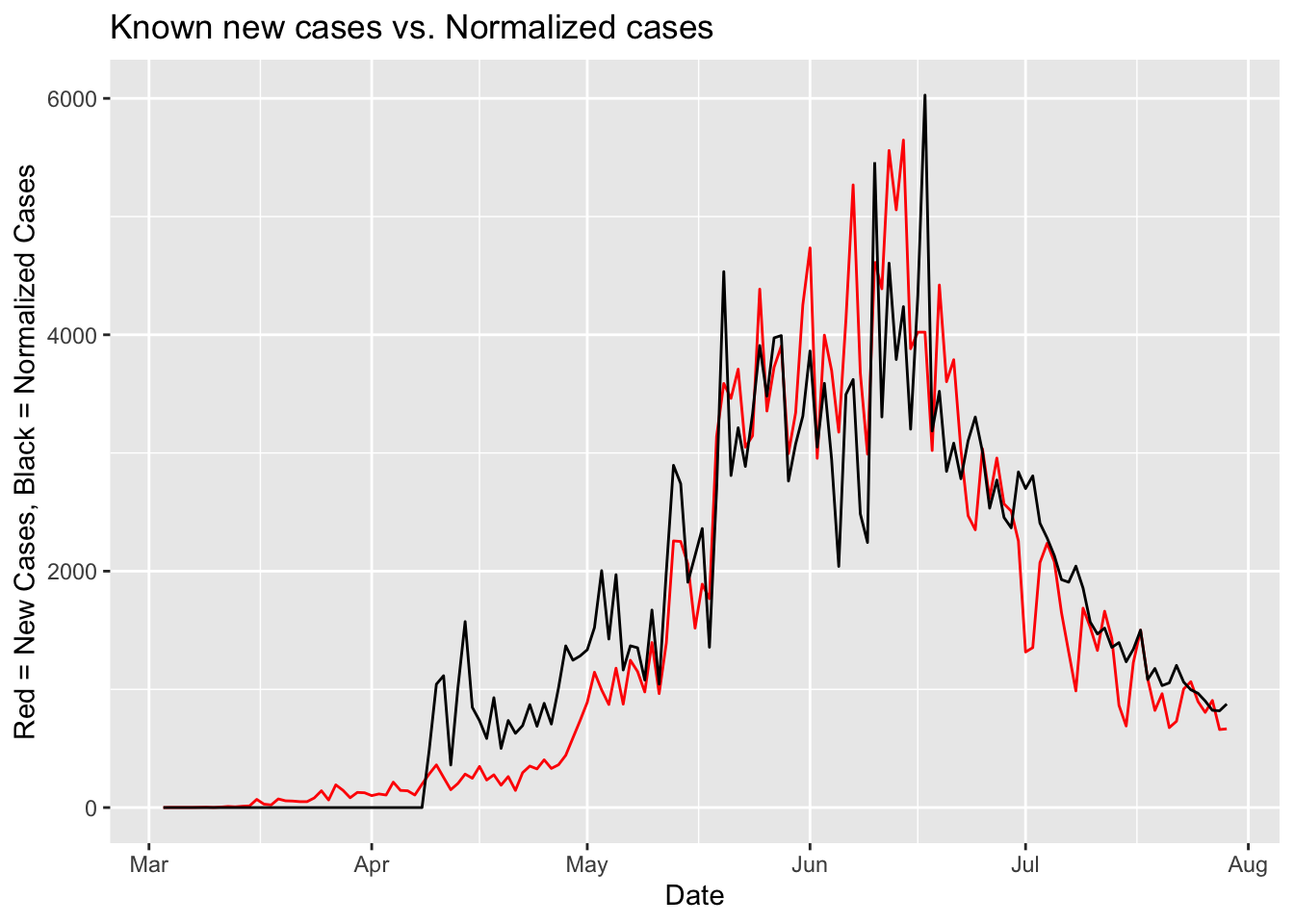
The above graph shows that the number of normalized cases has been following the same pattern as the real cases in July. Yes, the normalized cases are a little higher, with an average difference in July of + 284 cases, but they are reducing. Therefore it is fair to say that there has been a “slight improvement”. However, the fight against the virus must continue in Chile, respecting the rules of social distancing, the use of a mask and it would also always be good to increase the number of PCR tests, with tests done randomly on members of the public. With more tests the real situation with respect to Covid 19 con be better understood. Thank you very much for reading this publication, and hopefully it has been informative.
Metropolitana_Casos_PCR %>% filter(Mes == 7) %>% mutate(Diferencia = CasesNormalizados - NuevosCasosDía) %>% summary()## Fecha CasosAcumulados NuevosCasosDía ExamenesPCR
## Min. :2020-07-01 Min. :220467 Min. : 660 Min. : 4439
## 1st Qu.:2020-07-08 1st Qu.:232158 1st Qu.: 864 1st Qu.: 6349
## Median :2020-07-15 Median :241345 Median :1088 Median : 8332
## Mean :2020-07-15 Mean :240164 Mean :1214 Mean : 7692
## 3rd Qu.:2020-07-22 3rd Qu.:248352 3rd Qu.:1501 3rd Qu.: 8983
## Max. :2020-07-29 Max. :254354 Max. :2236 Max. :10138
## Mes DiaMes CasesNormalizados Diferencia
## Min. :7 Min. : 1 Min. : 818.8 Min. :-142.81
## 1st Qu.:7 1st Qu.: 8 1st Qu.:1055.1 1st Qu.: 44.85
## Median :7 Median :15 Median :1354.9 Median : 139.41
## Mean :7 Mean :15 Mean :1497.6 Mean : 283.74
## 3rd Qu.:7 3rd Qu.:22 3rd Qu.:1906.7 3rd Qu.: 379.15
## Max. :7 Max. :29 Max. :2806.0 Max. :1452.97